When thinking about the color yellow, we immediately think Van Gogh or Gustav Klimt’s golden yellow.
Who else used yellow pigments in such a powerful and bold way? But how does yellow translate into photographic terms?
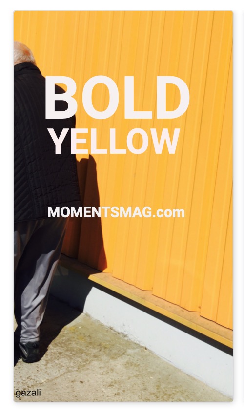
Bold yellow can be quite overwhelming to the eye but at the same time can present a specific mood and generate an atmosphere. To some it may simply look quite awkward. Although yellow is seen as cheerful it may bring up emotional energy especially if it occupies most of the frame.
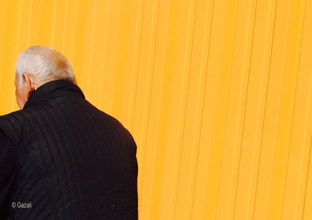
As people respond in different ways to the color yellow, it may be an interesting experiment to portrait a person, face hidden, behind a bold yellow that occupies the frame.
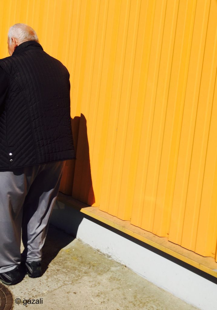
As the hidden face doesn’t show an expression it is compensated by the body language. The invisible face allows for an imaginative process to take place. The yellow in this instance should be a vehicle for extending the compositional mood, while the posture of the man placed at the far edge of the frame “captured in a tight space” is supposed to attract the full force of the yellow color, just maybe.
As with most experiments sometimes they work, more often they don’t, but at the end they are always fun.